16/10/11
Frieze Art Fair
Regent’s Park, London
13-16 October 2011
The problem – and also the joy – of visiting an art fair as vast as Frieze is quite where to begin, and how to get through it all without going into overload. This year, given my interest in the area, I decided to go on a trawl through the 170 exhibiting galleries looking primarily for art works involving text. This, as it turned out, didn’t necessarily cut down my scope all that much, since language – be it lengthy narratives, pithy phrases, solitary words, or isolated letters – is now fairly ubiquitous in the contemporary art world. They say if you’re looking for something, you start to see it everywhere, but I defy even the least textually-oriented visitor to come away unaware of its proliferation down the aisles.
We have, of course, many of the usual suspects in this field: Ian Hamilton Finlay (with a stone slab engraved with its title It’s Scotland’s Atlantis, undated), Barbara Kruger (Untitled (PRAY), 2011), Jenny Holzer (TOP SECRET Sleep Deprivation, 2011), a red and blue LOVE sculpture by Robert Indiana (1966-1995), and a couple of Tracey Emin neons (And I Said I Love You and You Made Me Love You, 2010), but these do not even begin to constitute the main core of the text collection on display.
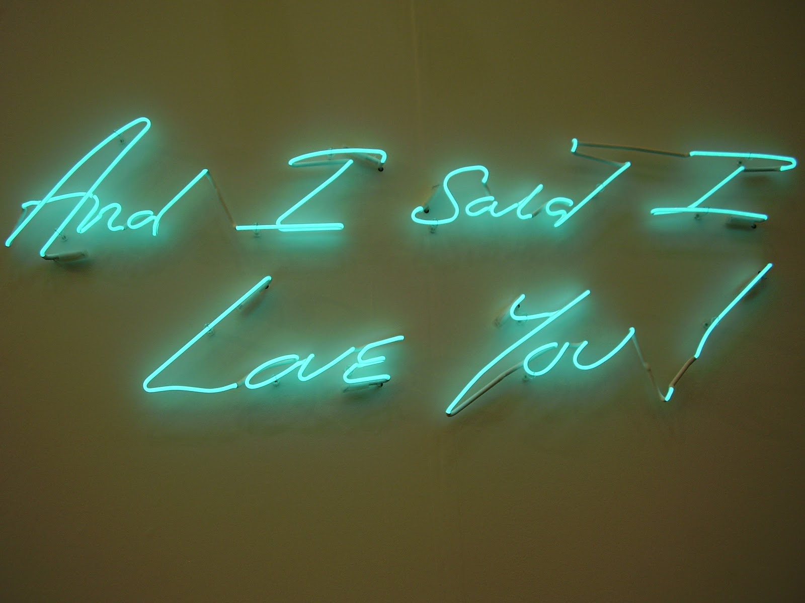
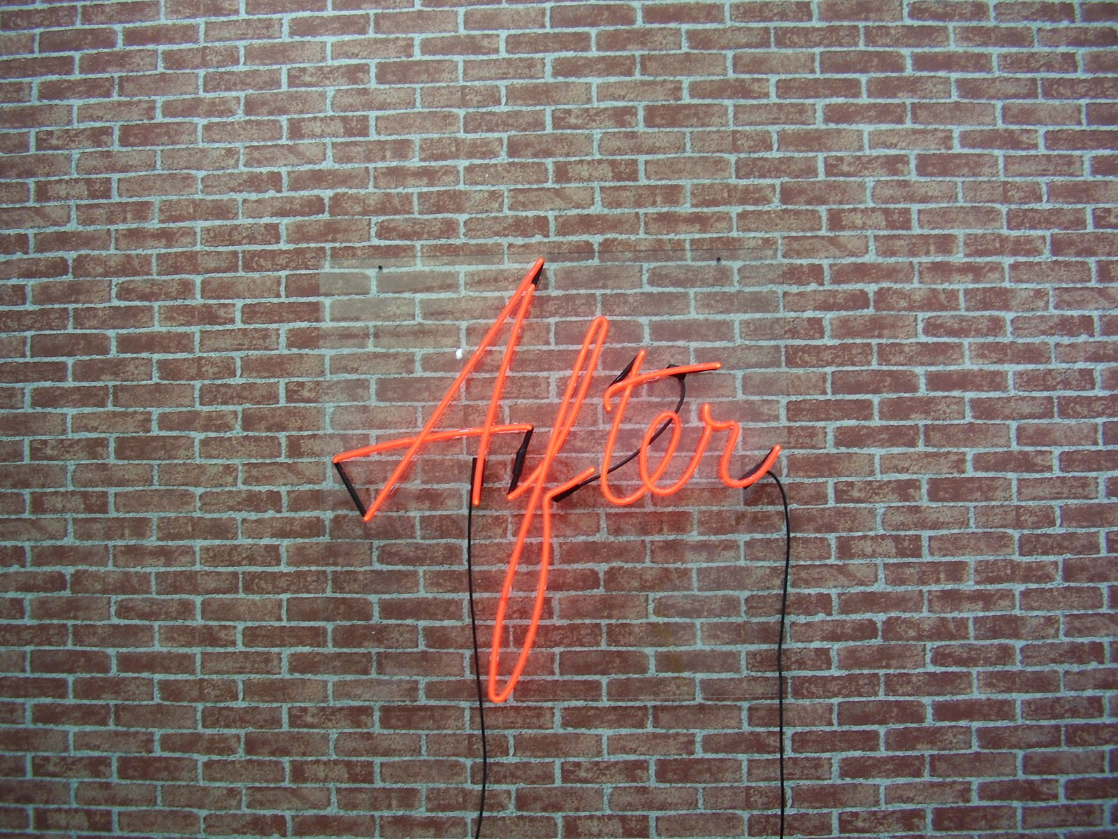
Neon, for example, seems to really have caught on. Alongside Emin, we find the neatly written, bright white Time Here Becomes Space, Space Here Becomes Time (2004), split across the two sides of White Cube’s display space, by the equally well-established neon writer Cerith Wyn Evans. More colourful, and espousing a somewhat different philosophical opinion, is Peter Liversidge’s rainbow-hued Etc. (2011), nineteen repetitions of this word, linked by dot dot dots: empty conversation held by superficial acquaintances as they greet one another at one of the commercial art world’s largest annual events? A newer convert to this medium, and restrained with just the one word, is video and installation artist Dominique Gonzalez-Foerster, whose red neon After (2009) has an almost graffiti-like appearance, projecting from against a wallpaper of bricks.
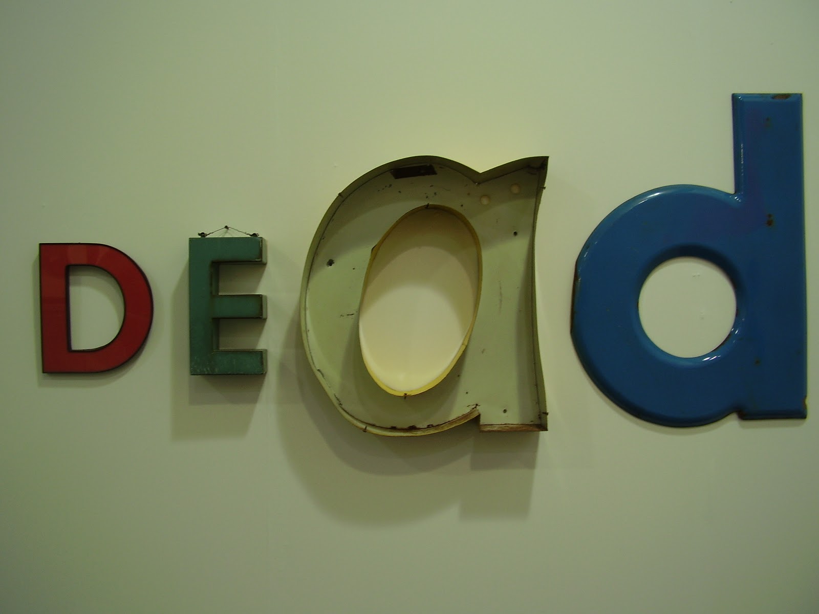
Jack Pierson looks beyond to a time of no afters with his metallic word sculpture relief of the word DEAD (unlabelled). Similarly abrupt, but dealing, in contrast, with the present, is NOW (#2 Mirror) (2011) by Doug Aitken. As the title would suggest, the three letters are built out of clear glass and mirror, sculpted in the form of a crystal, reflecting back the acute reality of the point in time referred to. Not for the first time, Douglas Gordon also combines mirror and text, with a large looking glass engraved in the top left and bottom right hand corners, forwards and backwards respectively, It’s Not About You, It’s All About You. Here the audience become part of the work, and it is amusing to watch the interaction as people unashamedly check their teeth and adjust their ties! Invoking the existence and loss of a third-party, Zhang Xiaogang, on the other hand, uses a mirror as the backdrop for a poem, written in English on the left, and Chinese on the right, separated by a yellow baby in weighing scales. The poem, a meditation on death and dreaming, is haunting and sorrowful, with the pitiful refrain of Gloomy Sunday.
Moving to examples of more factual text, there is a vast array of works incorporating newspapers. Rirkrit Tiravanija reappears with a smaller scale version of his series from Frieze 2009, The Days of This Society are Numbered, showing here a single enlarged newspaper front page with the words, this time in Spanish, painted over it in orange: Los Días de esta Sociedad son Contados. Marine Hugonnier’s Art For Modern Architecture GIr Guardian Iranian Revolution/Hostage Crisis (2011) and Sandra Gamarra’s Autocensura (2011) both involve a series of framed newspaper front pages (Hugonnier’s are 1979 editions of The Guardian; Gamarra’s are recent copies of El Pais), respectively silk-screened with blocks of colour over certain stories and columns, and painted over with white drapes to blot out photographs. (Holzer’s TOP SECRET, incidentally, follows a similar format, painted, with oil on linen, to resemble a U.S. government document with blocked out portions of text.) Tobias Putrih takes his obfuscation one step further in Times (April 12) (2011), in which a copy of The New York Times with strips cut from it hangs from a string on the wall. Finally, Melissa Gordon reproduces her own collage-effect of newspaper cuttings, painted on canvas, with bare patches showing through, in a compilation of stories entitled Double Perspective (Cassius Clay/Muhamed Ali) (2010).
First generation Conceptualist, Adrian Piper, is displaying two enlarged photographic cut outs set against silk-screened text, and a further photographic narrative, accompanied by a straight passage of explanatory text, is Nan Goldin’s sad 15 print documentary of the decline and death from AIDS of a movie star diva, Cookie Mueller (March 2, 1949 – November 10, 1989).
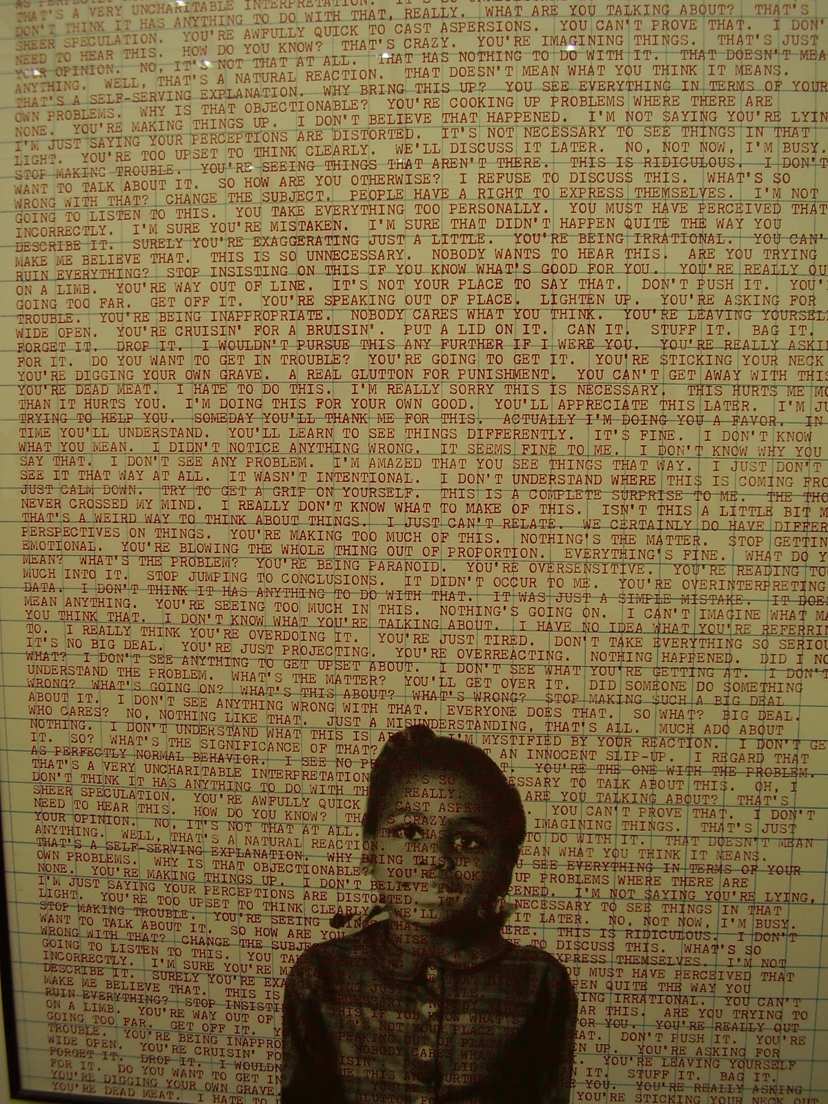
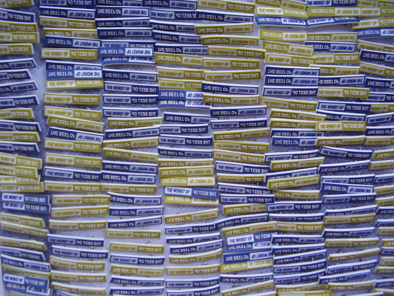
Nedko Solakov (Untitled from the Series Murmurings, 2007) and Stefan Bruggeman (Untitled (Definitions and Jokes), undated) both provide words and their definitions, whilst Heimo Zobernig composes a colourful amalgamation of seemingly random letters, superimposed on one another, on a canvas divided into quadrants. Equally bright is Deborah Kass’ diptych, Frank’s Dilemma (2009), upon which the words Daddy I Would Love to Dance blend into the technicolour camouflage. Simple and ironic is Ricci Albenda’s Diptych (2011) – ironic because it is a single frame painted with the incongruous text. Another real diptych, however, is offered in the form of James Richards’ The Best of The Worst of (2011), where PVC badges emblazoned with those words are pinned to printed nylon fabric, evoking both mass production of cheap objects and mass media mantra. This consumerist obsession is further reflected in Jonathan Horowitz’s Coke/Pepsi (80 cans) (2011), a play on Warhol’s Soup Cans (1962). Gabriel Kuri’s material receipt also calls into question the value of modern day commodities.
In some works, the text is playful, as, for example, in David Shrigley’s Untitled (This is Nothing) (2011), constituted by nine ink cartoons, including such sound bites as Put on lipstick and see what happens and We are constrained by ideas. In others, it is downright disturbing, as, for example, in Banks Violette’s I’d Rather Be Killing My Family (2011).
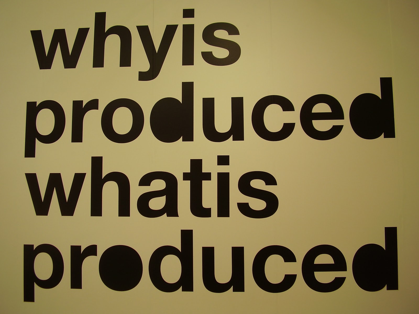
For some, the text is purely background, as is the case with Tim Rollins and K.O.S.’s Oedipus Rex (After Sophocles) (2008), seven frames, each of an eye, printed on paper with the imprint of Greek writing. For others, the lettering constitutes the entire work, as, for example, with Liam Gillick’s Why is Produced (2011), where black vinyl letters have been applied directly to the wall. Dan Perjouschi’s Freedom of Speech II (2010) takes this one stage further still by importing a cut out section from an actual wall installation, originally hosted at NBK Gallery, Berlin.
As well as the gallery spaces, Frieze annually commissions a number of projects, inviting selected artists to come and respond to the architecture and enviroment and produce works which visitors will encounter as they move between the stands. Unsurprisingly, one of this year’s projects also involves text: Laure Prouvost has decorated various walls with comical white on black, hand-painted signs, often quite discordant and always provoking a smirk. So really, wherever you go, you cannot help but be confronted by words that are art, and art that is words. I could go on, but you are probably already at your own saturation point by now! Maybe next year I will need to narrow down my focal point somewhat further, for if the use of text in art continues to grow at this rate, I might need to spend even longer than one full seven hour opening stretch even to make a scratch on the surface of all there is to offer.
