15/04/16
Interview: Peter Tatchell
In the early 1970s, the windows of Melbourne’s main
department store, Myer, regularly caused something of a stir. The young man
working in the design and display department had a rather radical approach and
created designs that stepped outside traditional design parameters: dismembered
mannequins painted with psychedelic colours, vertical stripes that made the public
‘giddy and nauseous’, clothes lying on the floor at the feet of mannequins
wrapped in brown paper and string. The young man responsible? None other than
Peter Tatchell.

‘Art was one of my favourite subjects at school and I did
very well at it,’ he recalls. ‘I left school at 16 and my parents couldn’t
afford to send me to art college or university, so I opted for the next best
thing, which was to work in the design and display department of one of
Melbourne’s biggest department stores, where I learnt on the job, doing
windows, interiors, graphic design and logos.’ Tatchell got hauled in to his
boss’s office on numerous occasions to be questioned about ‘those windows of
yours’, but, thankfully, each time, his boss relented. Not surprising, when you
realise the talent that Tatchell brought to the job. Working overtime, three
nights a week, he also designed and helped manufacture the Christmas windows,
which, each year, featured a different fairy tale. ‘They took a whole year to
make,’ says Tatchell. ‘One year was Sleeping Beauty, another year was an
Australian fairy tale called The Gumnut Babies. The windows were animated and
each one would feature a scene from the fairy tale. A team of us would design
the windows and then manufacture the tiny mannequins, the costumes and all the
mechanics to make the moving parts. Our Sleeping Beauty windows in 1970 won an
international gold medal. Another famous series of windows that I worked on was
for British Week in 1970 or 71. We chose to display the merchandise using Shakespearean
plays. Each window was a modern adaptation set of a Shakespearean play. They
were essentially making abstract theatrical designs featuring clothes. They
also won awards.’
When Tatchell moved to London in 1971, he was immediately
involved in campaigning work with the Gay Liberation Front and later with
OutRage!. His style of activism has always been hugely influenced by his
graphic design background. ‘From the outset in my campaigning, I always sought
to use visuals and graphics as a way of getting across a human rights message,’
he says. In late 1971, for example, the GLF joined with the Women’s Liberation
Movement to hold a joint protest outside the Royal Albert Hall during the Miss
World contest. ‘Instead of the standard picket, the GLF organised an
alternative pageant, which featured a bloodied and bandaged Miss Ulster, at the
time of the war in the north of Ireland, and a starving and emaciated Miss
Bangladesh, to symbolise the mass poverty and hunger there. We also had a
number of other “contestants” including Miss Treated and Miss Conceived. It was
a protest but also a spectacle. It engaged both people going to the real Miss
World contest and also passers-by. Huge crowds stopped to watch, which they
wouldn’t have done, if it had just been a bog standard protest with placards.
I’ve always conceived a good protest as being one that can educate and
entertain. The most effective way to get a message across is to make someone
laugh or just give them a visual feast. People who may not be swayed by an
angry fist, a militant slogan or a placard, are likely more receptive to a
visual protest that involves a degree of humour and imagination.’
This ethos has held throughout Tatchell’s activist career.
The Kiss-In and Wink-In organised by OutRage!, for example, were both highly
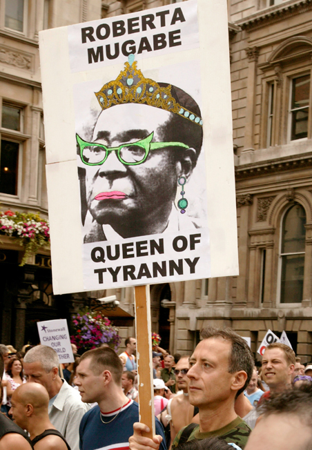
visual spectacles, as are Tatchell’s annual Pride placards, ridiculing public
figures, such as Nick Griffin, Robert Mugabe and President Putin, by mocking
their pretensions to machismo, their heterosexism and homophobia. For example,
the Mugabe placard shows the Zimbabwean president with pink lips, wearing a
gold diamond tiara, green butterfly Mary Whitehouse glasses and drop earrings,
with the caption: ‘Roberta Mugabe. Queen of Tyranny’. ‘I think that’s far more
effective than the bog standard placard or banner,’ says Tatchell. ‘Obviously a
bit of art and imagination goes into the design.’
This week sees Tatchell opening this year’s Emerald Winter
Pride Art Awards at the Islington Arts Factory. The awards are open to
everybody, regardless of gender and sexuality. ‘I think it’s a good idea that
the awards are open to all comers, LGBTI and straight,’ says Tatchell. ‘It
helps break down barriers and builds a community of interest between people of
all sexualities and gender identities. The key thing about the awards is that
they have some element of LGBTI relevance and focus, whether that’s by a
straight or LGBTI artist is secondary. I welcome the fact that there are
straight artists who want to do work with LGBTI themes – that’s terrific. The
entries and winner should be judged on their merits, as long as they have some
kind of theme around sexuality, gender and identity. I am not a gayist. There
are some people in the LGBTI community who take the view: “It’s our life, it’s
our community, it’s our struggle. Straights – f*** off!” I don’t take that
view. I welcome friends, allies and supporters from the straight community.’ And,
as regards selecting a winner, unsurprisingly Tatchell would be looking for an
entry that is ‘imaginative, daring, unique and with a strong emotional impact.
Whatever has the best and biggest impact should win’. From his very beginnings
as a window dresser, to the height of his activist career, visual impact has clearly
been the key to Tatchell’s success.